
Yesterday I visited the Lukas Feichtner Gallery again. I like going there because a visit is never just a quick glance at the works on display. It is a place where you can take your time looking—and where looking can lead to conversation. Mr Feichtner is knowledgeable and welcoming, and our conversation this time gave me another way of seeing the exhibition.
Fritz Bergler’s Gimme Shelter is currently on view. After admiring works by Hannes Mlenek at the gallery, I was now very taken with Bergler’s work. The exhibition has a presence all of its own. Many small pictures are assembled into large installations: on cardboard, unframed, and arranged closely together. They do not feel like separate works that happen to share a wall. Together, they form an expansive image field that gradually reveals itself as you look more closely and move through the space.
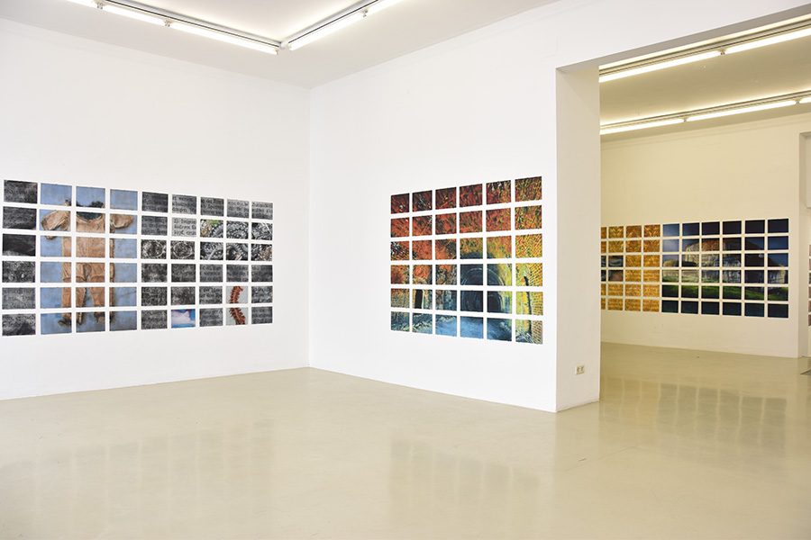
The eye has to find its way around. You take in the installation as a whole, then pause at individual panels. Relationships emerge between them: repetitions, interruptions, shifts between image and writing, grey surfaces and colour. Because the individual pictures are unframed and mounted on cardboard, the work retains something direct and unfinished. It does not seem to resolve itself in a single, self-contained image. It spreads out, grows from its individual parts and asks you to discover the connections for yourself.
The writing particularly caught my attention. Individual words and fragments appear in printed letters on grey, grid-like panels. They resemble excerpts from book pages, as if lines had been lifted out and placed in small image fields. But they do not form a continuous text. There are too few fragments, and they come from different lines. You recognise language and want to read, yet cannot assemble the words into a single, definite meaning.
That interruption is powerful. The writing remains language and becomes image at the same time. It invites you to read, then holds you back. Your eye moves between the fragments, the grey panels and the neighbouring images. You are not simply reading a text; you are looking at writing.
There is also an intriguing shift in material: the letters look printed, but they are painted in oil. They are not merely reproduced writing transferred onto a surface; they are part of the painting. Colour, surface and sign belong together. The writing has not lost its legibility entirely, but it cannot be reduced to information either. It becomes a painted form within a larger installation.
The language itself is also striking. Bergler works with German words; I use Latin in my images. I like that his work does not automatically turn to English in order to appear internationally accessible. German remains specific and audible. At the same time, the fragments can have an effect even when you cannot fully decipher them. The painting offers a way in that does not depend entirely on understanding the text.
I was very taken with the exhibition, and my conversation with Mr Feichtner completed the visit. For me, the Lukas Feichtner Gallery is a place well worth seeing—not only for the works, but also for its knowledgeable, welcoming staff and the chance to talk about art. Information about the gallery and its exhibitions is available at feichtnergallery.com.
Two different approaches to writing
Bergler’s work made me look more closely at my own use of writing. Not because I want to equate our work. That would be neither appropriate nor my intention. Bergler is an established artist with an independent practice; my photographic work follows its own path. What interests me is how differently the same material can be used—and what this encounter helps me understand about my own questions.
Bergler takes writing out of its ordinary context. The words and fragments are no longer simply parts of a sentence to be followed from beginning to end. They become painted signs in a large installation assembled from many parts. My approach is almost the reverse: I write by hand and place the writing directly on skin. I am interested in how a word follows a shoulder, an arm or a back; how it interacts with light and shadow; and how the body changes it.
For me, both approaches meet in one question: when do words stop being merely information and begin to work as images? In Bergler’s work, this happens through fragmentation, painting and the arrangement of many individual panels. In mine, it happens through ductus, skin and the direct encounter between the writing hand and the body. The approaches are different, and that is exactly why I find it stimulating to think about them side by side.
Writing was not originally part of my photographic projects. It was meant to remain an exception, a means for a specific project: to describe Georg Trakl’s poems in another way, rather than illustrate them.
That distinction matters. Illustrating a poem can easily mean recreating its images: evening, autumn, sister, decay, darkness—and before long there is plenty of fog and a melancholy figure standing in front of a ruin. That can work. But it can also look as if someone has mistaken poetry for a decorative instruction manual.
I was interested in something else: what happens when words themselves become visual material? When they do not simply sit beside a body, but lie on it, follow its shape, distort with it, disappear and reappear?
One project led to another. The writing stayed.
From surface to skin
My first idea was technical and, as I soon discovered, fairly demanding. I wanted to write words or fragments on paper, photograph or digitise them, cut them out and then place them on the body. The writing would have to follow the curves of shoulders, arms and hands. It would need to stretch, break, recede into shadow and be integrated into the photograph using different layer modes.
At first, that sounds like an editing technique. In reality, it would have become a separate and very time-consuming form of image-making. First the writing would have to be created—with ink, nib, pressure, chance and all the small irregularities left by the hand. Then I would have to digitise it carefully and remove it from the paper so that only the actual strokes remained, not the white background.
A word that looks convincing on a flat page does not automatically sit convincingly on a shoulder blade, a rib, an arm or a hand. It has to follow the anatomy. Letters stretch over curves, tilt at edges, disappear partly into shadow and break where the body itself interrupts the line. Text running across a back must not look as though someone has laid a transparent sheet over it.
So the writing would need more than perspective distortion. It would have to fit into the image’s lighting. If light falls across a shoulder, the writing has to respond to that light. It cannot remain an evenly dark imprint in the bright areas; it has to recede into the shadows. Skin texture, pores, folds, fine hairs and the small irregularities of the surface must not disappear just because a word lies on top. Digital writing must not be sharper than the skin it supposedly rests on, and it must not look like a foreign object against the image’s grain, softness and tonal range.
It is not enough to set a layer to “Multiply” and be pleased that the writing now looks dark enough. That would only be the beginning of a process involving adjustments, masks, local dodging and burning, distortion, softening and the restoration of texture. I would have to decide whether shadows could swallow individual letters, whether a highlight should cross the text and whether a word should remain legible where the body itself seems to dissolve it.
The writing would have to behave as though it belonged to the same lighting situation—not as though it had been added after hours. It could work. But it would mean investing many hours without knowing whether the result would be an image or simply a technically respectable reason to close the file for good. Photoshop saves very patiently. That does not mean the result has to live.
At first, the digital approach also had a personal reason. I did not want to come closer to my models than necessary. The body should not become a surface I simply use. Adding the writing later on a screen initially seemed the more respectful solution. A camera already creates a particular kind of intimacy. I did not want to extend that intimacy through touch as a matter of course.
Then the models themselves suggested something: why not write the words directly on the body?
That changed the work completely. It was no longer: I alter a body on screen afterwards. It became: we create a surface together, where words, skin, light and movement can speak to one another.
Writing on skin is not the same as writing on paper. It follows the body’s temperature and tension, its breath, its curves and its small movements. A stroke can grow finer on a shoulder, travel along an arm, break at a fold or disappear into shadow. A letter is not digitally distorted afterwards because the shape of the body gets in its way. It is formed with that shape from the start.
It is more immediate. And more truthful.
What trust makes possible
Writing directly on a body requires trust—very concrete trust. It has to be clear where the writing will go, which words will be used, which areas may be touched and where the boundaries are. No means no, without explanation. Hesitation is not something to overcome by persuasion. A good idea is never more important than the comfort of the person in the image.
Trust cannot be claimed. It can only be earned.
I am deeply grateful to my models for that trust. Some of them would not allow this kind of closeness with anyone else. They do so because, over many shoots, they have learned that my hands do not wander; that there are no inappropriate looks, comments or touches; and that the body is not an excuse for crossing boundaries, but part of a shared artistic process.
That is neither incidental nor something I take for granted. It is something beautiful. Not only because it makes images possible that otherwise would not exist, but because it shows what collaboration in photography can be: not one-sided control over a model, but a form of attentiveness. A line is placed on skin, but it comes from trust.
Then there is a moment no amount of elaborate editing can replace. The model is lying on the massage table, the writing is on her skin, and the work is finished for now. I take a quick phone photo and show it to her.
I regularly feel as happy as a child: at the delighted cries, the gleam in her eyes, the expression on her face when she sees the writing on her own body for the first time.
At that moment, it becomes especially clear that nobody has simply been written upon. The words belong not only to the image and not only to my idea. For a moment, they have become part of this person. And she sees herself not only as a model, but as the co-author of a work that could not exist without her.
The voice of a script
In my photographic work, it is not enough for a word to be readable on a body. The writing has to carry emotion. It has to bring something with it before the first letter is understood.
The same is true of my flip charts. Writing is never neutral. It says something about pace, closeness, distance, discipline, memory or resistance. The audience reads not only the sentence; unconsciously, it also reads the hand that wrote it.
Copperplate produces a different effect from Bastarda. Copperplate feels controlled, elegant, sweeping, almost polite. Its fine hairlines and strong downstrokes demand attention. It can convey tenderness, formality, longing or cultivated restraint.
Bastarda brings a different world with it. It developed in the late Middle Ages, in the transition to the Renaissance, from Gothic and cursive forms. Its broken, dark, compressed letters can feel more physical and weighty, sometimes almost defiant. University of Zurich: Bastarda and Gothic Cursive
Kurrent, in turn, can feel private, archival, hurried and restless. It is not simply a “script from 1900”; its history goes back further. But its forms shaped German letters, accounts, official documents and personal notes in the nineteenth and early twentieth centuries. Its narrow, pointed, slightly slanted letters can feel like a voice from a drawer: a letter that may never have been answered. University of Zurich: German Kurrent Script
None of these scripts has a fixed meaning of its own. Copperplate is not automatically tender, Bastarda is not automatically dark, and Kurrent is not automatically nostalgic. But each has its own grammar of movement. Each makes some feelings easier to express and others harder. Choosing a script is therefore not a graphic decoration; it is a decision about the tone of an image.
Bergler’s painted fragments reminded me that writing in an image does not have to be fully legible to have an effect. You want to read, linger over individual letters, and then realise that the meaning cannot be fully recovered. My work creates a different tension: the words are genuinely written, often by hand and directly on skin. They remain legible, but the body’s shape, the ductus and the lighting all transform them.
The works are not equivalent, and I do not want to judge them by the same measure. For me, this encounter is an opportunity to see my own questions more clearly. Bergler’s installation shows how writing can become part of a visual whole through painting and fragmentation. My photographs explore how handwriting and the body give it another kind of presence.
Historical scripts matter to me because they do not merely look beautiful. They carry a past with them. Copperplate carries elegance and discipline; Bastarda, density, weight and an almost physical darkness; Kurrent can feel like a personal trace, something from a letter, a drawer or a family album. Even if you cannot name the script, you can often sense that it does not belong to the present.
No lettering can simply replace that. This is not a dismissal of lettering. It is its own art form and can complement images beautifully. But historical scripts have another kind of depth. They are not only designed; they have been handed down. They have a ductus, a history and resistances that have to be learned by hand.
Perhaps that is why the models respond so strongly. They do not simply see words on their skin. They see their own body become, for a moment, a page from an old book, a letter, a document or a secret note. The writing does not turn the skin into decoration. It gives it a second time.
And because the writing is made by hand, directly on the body and in its own ductus, something emerges that no digital font or perfectly arranged lettering can create: the feeling that the words truly belong there.
Ductus and return
The word for this is ductus. It describes how writing is made: the order and direction of strokes, pressure and release, pace, rhythm, the angle of the nib, transitions, interruptions and the resumption of a line. Ductus is not simply the appearance of a finished letter. It is the movement that brought it into being.
You can copy a letter. You can only learn its ductus.
Without absorbing it, you draw the script rather than write it. The letters may look right, but they have no breath. Once you have learned it, the hand no longer works against the form; it moves within it. The writing is no longer placed on top. It becomes embodied.
That matters to me. I do not want to use scripts as decorative tools. When I write them, I want, for that moment, to become that script. Copperplate on a body can feel like a gentle but exacting touch. Bastarda can settle into the image like a weight, a memory or an assertion. Kurrent can whisper, hurry, almost apologise or leave something personal behind.
It may sound contradictory, but writing on a naked body can both cover and reveal it. Not like a hastily applied fig leaf, but as an additional layer. Words come between the viewer and the skin. They direct the gaze, create distance and turn the body into a page, a document, a map or a place of memory.
Writing can also reveal the body. A word placed in a particular spot can draw the eye there. It can name something we might otherwise overlook. It can turn a shoulder into a burden, a back into a line of escape, a hand into a sign. The text is then neither commentary nor caption. It becomes part of the composition.
That is especially true when the words do not simply explain. Good writing in an image does not say, “Here you see sadness.” It creates another layer of meaning that opens the image, unsettles it or turns against it.
I worked with calligraphy before. I wrote on goat parchment and on specially prepared skin, as writing was made on parchment for centuries. I used a pointed nib, a peacock-feather quill and simple brush-tip markers. Every tool writes differently.
The pointed nib requires pressure and release; it creates Copperplate’s fine upstrokes and heavy downstrokes. The quill has its own resistance and unpredictability. A brush pen can be faster, more immediate and more gestural. The same letter is never quite the same twice, because tool, material and hand renegotiate it each time.
At the time, I thought I had left this subject behind. It belonged to another period. It is all the more interesting that writing has now returned to my life—not as repetition or nostalgia, but from another direction: through photography, bodies, Trakl, the trust of my models and the desire to make words not only readable but physical.
Perhaps certain subjects never really disappear. They wait until we find the right form for them.
In autumn, after a long break, I will take a calligraphy course again. Not to make my flip charts prettier or to start writing invitations in elegant script. I am interested in the discipline behind it: repetition, concentration, ductus and the movement of the hand. Learning a script means accepting its pace. You cannot persuade it. You have to follow it until it no longer feels like a foreign form.
The Leonardo project is already online. So far, one image has been published under the series title Studia Rubra; more will follow. Drawing, writing, observation and the human body come together there in a way that is also connected, for me, to returning to calligraphy. The work has already begun and will continue to develop with the images to come.
Perhaps that is why Bergler’s exhibition spoke to me. It showed me another way of working with writing and, at the same time, made my own approach clearer. We can choose the same material and still ask completely different questions of it. Writing can enter an image or touch a body. It can organise space, resist or create closeness.
Not every image needs words. But some images only begin to speak when they carry them.